


The emotions that come out of the box
Arc is GoodFlip's first smart ring. Setting up a new gadget is the most excited a person ever gets about it. How did we handle them?
tl;dr
- What
- The first-time connection journey for Arc: everything between opening the app and the first daily targets a person wakes up to.
- Why
- Setting up a new gadget is when a person is most curious about it. That attention does not come back later, so the setup is where the ring earns its place.
- My role
- End to end. The teardowns, the philosophy, the scenarios, the flows, the storyboard, the prototype and the visual design.
The first five minutes
Arc has no display and no button. It cannot tell you it is working, or that it heard you. Everything a person feels in those first five minutes comes from their phone.
And the phone asks for a lot. A permission. A wait on a radio that can fail without explaining itself. A date of birth, a height, a weight. Three targets to live by. All of it before the ring has given anything back.
Every one of those is a place where excitement can turn into doubt, and the person is already holding something they paid for.
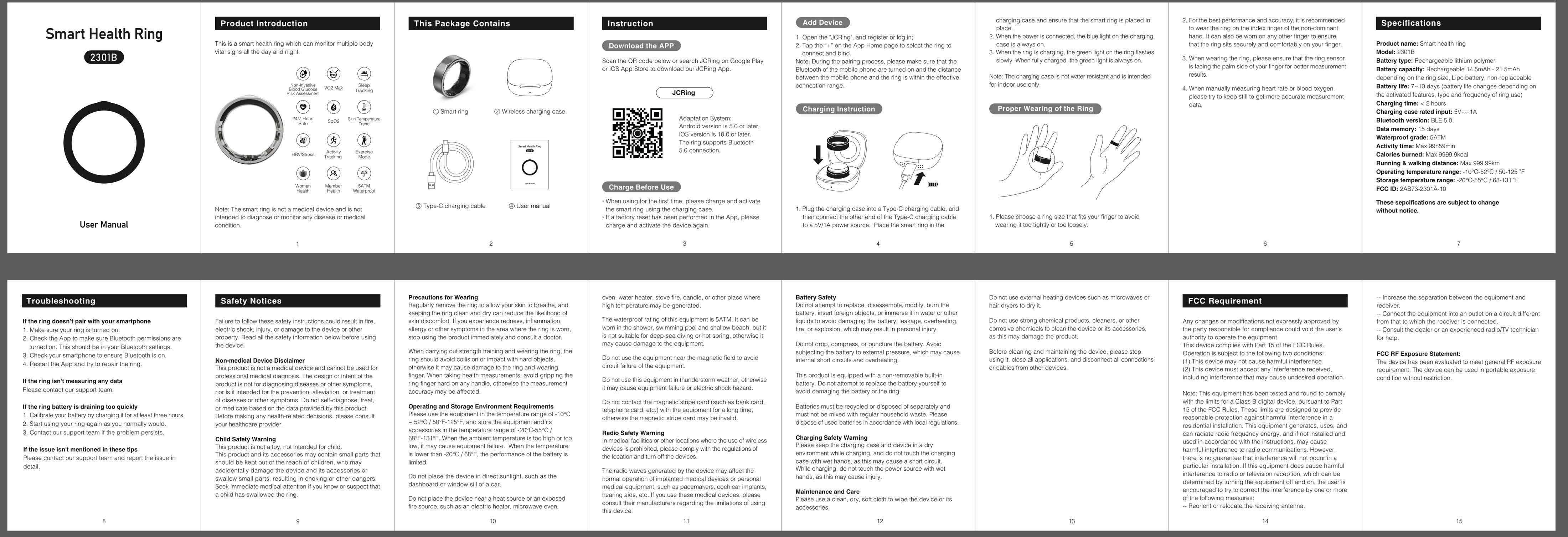
The hardware manual
The hardware ships with a folded paper manual, and it turned out to be the only place the real constraints are written down. The ring will not announce itself over Bluetooth below ten percent charge. It binds to one account the moment it pairs. It wants about thirty minutes on the charger before a first attempt is worth making.
Three lines on a leaflet, and roughly half the failure states in the journey trace back to them.
The competition
Then I sat through everybody else's first five minutes. Ultrahuman, Oura, HART, JC Ring and boAt, captured step by step, plus the setup walkthroughs people post for the Samsung ring when the app does not explain itself.
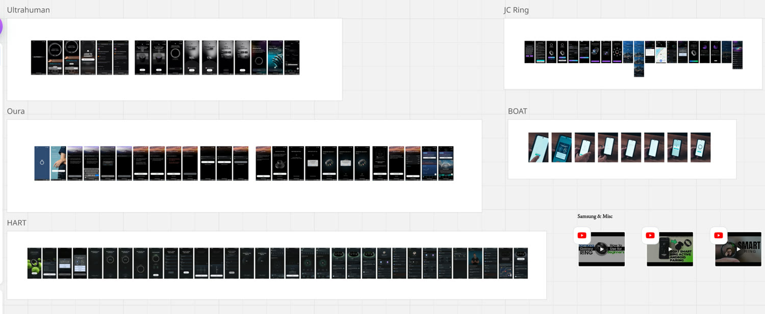
They agree with each other more than they differ. Setup is a form to get through. Once you are through it, the ring hands over a dashboard and leaves you to work out what any of it means. None of them use those first minutes to say what the ring is for.
Control or care
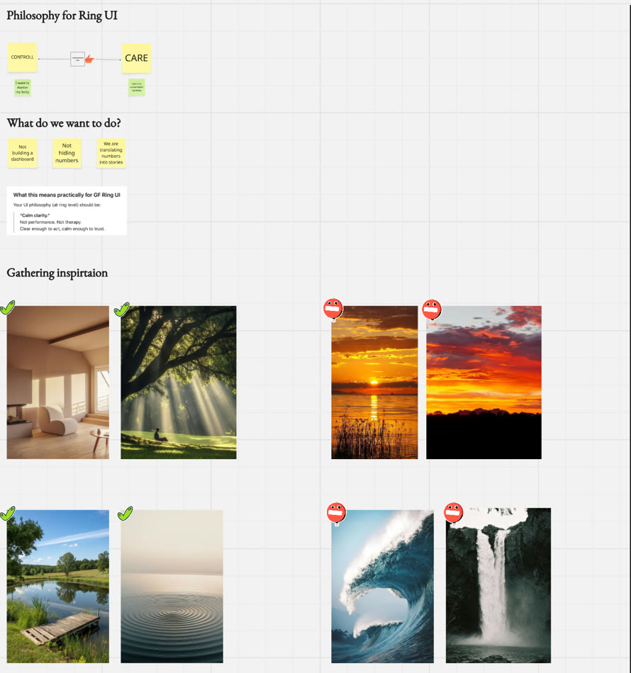
Before anything got drawn, we put the category on a line. At one end sits control, the person who wants to master their body. At the other sits care, the person who wants to understand it.
Control
“Push me harder.”
Care
“Help me understand.”
From there, three commitments went on the board and stayed there:
- Not building a dashboard
- Not hiding numbers
- We are translating numbers into stories
Which resolved into two words the team could argue with for weeks afterwards: calm clarity. Clear enough to act, calm enough to trust.
Then we voted on a wall of imagery, so the phrase became something anyone could point at. A room with light in it, sun through trees, a still lake, one ripple. Out went the sunsets, the breaking wave, the waterfall. Anything performing intensity was wrong for a person who is already anxious about their body.
User stories and usability scenarios
The design work began as two tables rather than a canvas. The first held user stories, the plain things a person wants: to know the ring holds enough charge to bother, to understand why the app wants Bluetooth before granting it, to give the thing a name that feels like theirs, to know exactly what it will measure before handing over a date of birth. One row belonged to somebody who received the ring as a gift and has to set it up without the person who bought it.
The second table held usability scenarios, every realistic way it breaks. That one got longer.
- Bluetooth is switched on in settings, and the person comes back. Does the app notice, or does it still insist Bluetooth is off?
- Open Settings lands on the root of settings on some Android builds. On a Xiaomi or a OnePlus, finding Bluetooth from there is its own small journey.
- Three GoodFlip rings in range at a gym. A serial number alone is not enough for a person to know which one is theirs.
- A ring appears at ten seconds and drops off by thirty, because its advertising interval changed. Tap it or wait?
- A call arrives mid-search and the app goes to the background. On return, is that result still true?
- Twenty seconds of quiet searching. That is roughly where people decide an app has frozen.
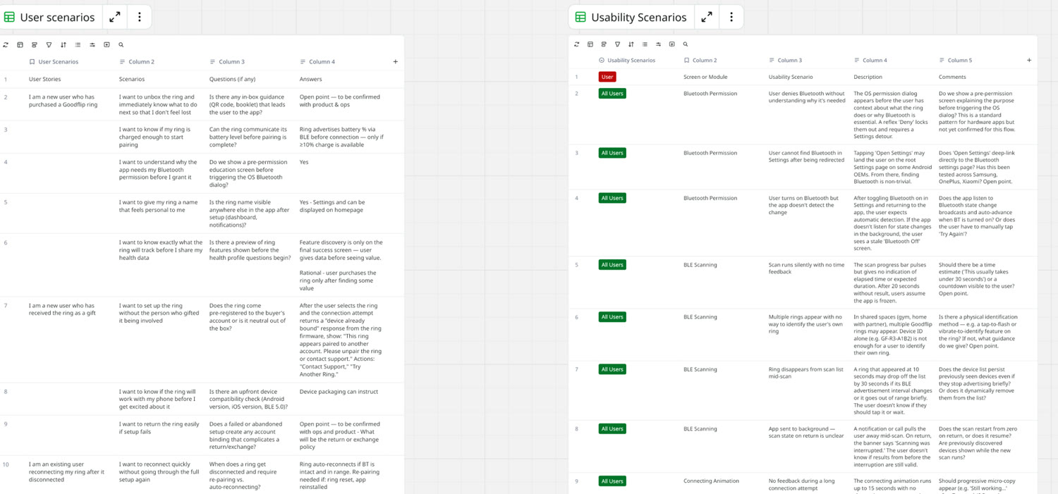
Most of the journey was settled in those two tables. By the time anything got drawn, the arguments had already been had.
The connection flow and its branches
The happy path is short. Open the app, allow Bluetooth, charge the ring and keep it close, pick it out of the list, name it, answer four questions, accept three targets.
The work sits in the branches. Bluetooth denied. Nothing found. Found but flat. Found but not yours. Pairing timed out. Already bound to somebody else's account. Under eighteen. Each one needed a place for the person to land that was not a dead end.
- start and end
- a step
- a decision, both exits named
- the person acts
- the app acts
- a way it fails
- the rule we wrote for it
Arrive
Permission
Pair
Make it yours
Hand over
- startOpens the GoodFlip app
- the person
Ring card
- Purchase
leaves the journey
Shopify store
decisionRing landing page
← Connect an existing ring
decisionIs Bluetooth on?
NoAsk for the permission. If it is denied, say why the ring needs it and open device settings.
↵ rejoins on Allowed
← Yes
the appInstructions
- Charge the ring
- Keep it close
- Stay in the app
- Ring not chargedNo ring found
Charge until the light turns green, about 15 minutes. If nothing turns up, offer help instead of a dead end.
← Start pairing
the appScanning for the ring
- Battery too low
Warn about the charge, and let them carry on if they want to.
the appRing found
- Strongest signal first
- decision
Is this your ring?
NoEvery ring in range, each with its name and signal strength.
↵ rejoins on Selects one
- Pairing failsConnection times out
Name what failed and allow a retry.
← Yes, connect
the appConnecting
Autofill it as “Shaheer’s Smart Ring” from the profile, and keep it inside the 20-character Bluetooth limit.
← Connected
the personName your ring
- Under 18
Cannot proceed.
the personAsk for
- Date of birth
- Sex
- Height
- Weight
- the person
Setting goals
- Steps
- Sleep
- Calories
- the app
Sync previous data
Say that readings take time to arrive, and to keep wearing the ring.
the appRing features
- Shown for discoverability
- endRing home
The storyboard
Calm clarity is easy to agree with and hard to draw. So the journey went through a storyboard first: six moments, each written as a feeling and given its reference imagery before it became a flow.
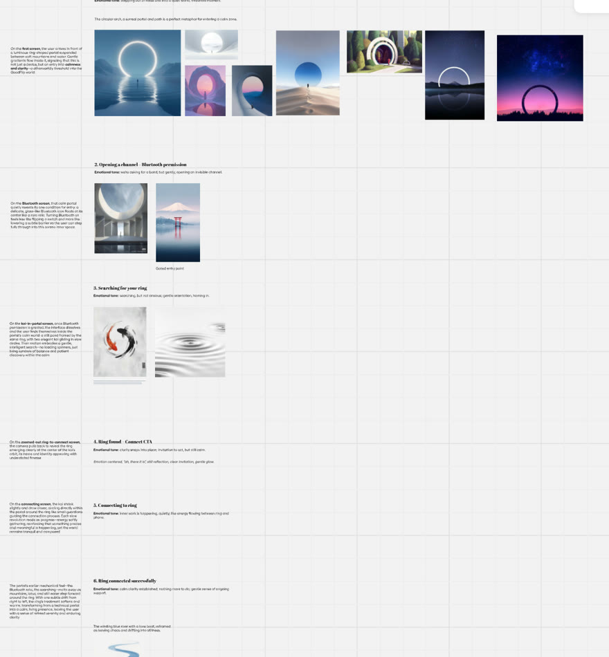
Everything visual downstream comes from those six lines. The koi in the pairing wait exist because beat three asked for searching that feels patient.
The prototype
The whole thing went into a clickable prototype next, built quickly with Claude so we could walk it end to end in an afternoon. Plain shapes keep the conversation on order and wording. Naming the ring moved ahead of the health questions here, because handing over a date of birth reads differently once the thing on your finger has a name.

Visual design
Then the visual language went on: the arch from beat one, the koi from beat three, and the warm still water at the end. Watch it whole, or take it apart a moment at a time.
Decisions
- 1
The wait needed something to look at. Twenty silent seconds is where a person decides an app has frozen. Koi circle in the exact space the ring is about to appear in.
- 2
Explain the permission before asking for it. Bluetooth is the only permission we request. Every question after it carries a line naming where the answer goes.
- 3
Say that everything can be changed later. The name, the targets and the goals can all be edited, and the app says so while it sets them. Nobody should feel locked in on day one.
What we’ll be watching
Arc has not reached anyone yet, so three numbers will tell us whether this works: how many people who start reach a connected ring, how many get there on the first attempt, and how many come back on day two.
The last one is the real test. Connecting a device is easy to force with persistence. Coming back the next morning is what the whole journey was built for.
What I learned
Design for how a person feels, and the rest gets easier. Don Norman's argument in Emotional Design is that attractive things work better, because someone in a good mood is more tolerant of small difficulties and quicker to find a way around them. That is the whole case for the koi. They did not make the Bluetooth search any faster. They gave the wait something to be about, and a person who feels calm forgives a lot of what the technology cannot do.
Every hard part of this journey was an emotional problem wearing a technical costume. A permission is a question of trust. A silent search is a question of doubt. Four questions about a body are a question of what you are going to do with the answers. I want to start from the feeling on the next one too, and let the flow follow it.
Credits
- VB
Vishal Bansal
Design Manager
Design critique and guidance.
- DS
Daksh Sharma
Senior Product Designer
Brainstorming, and creative ideas along the way.